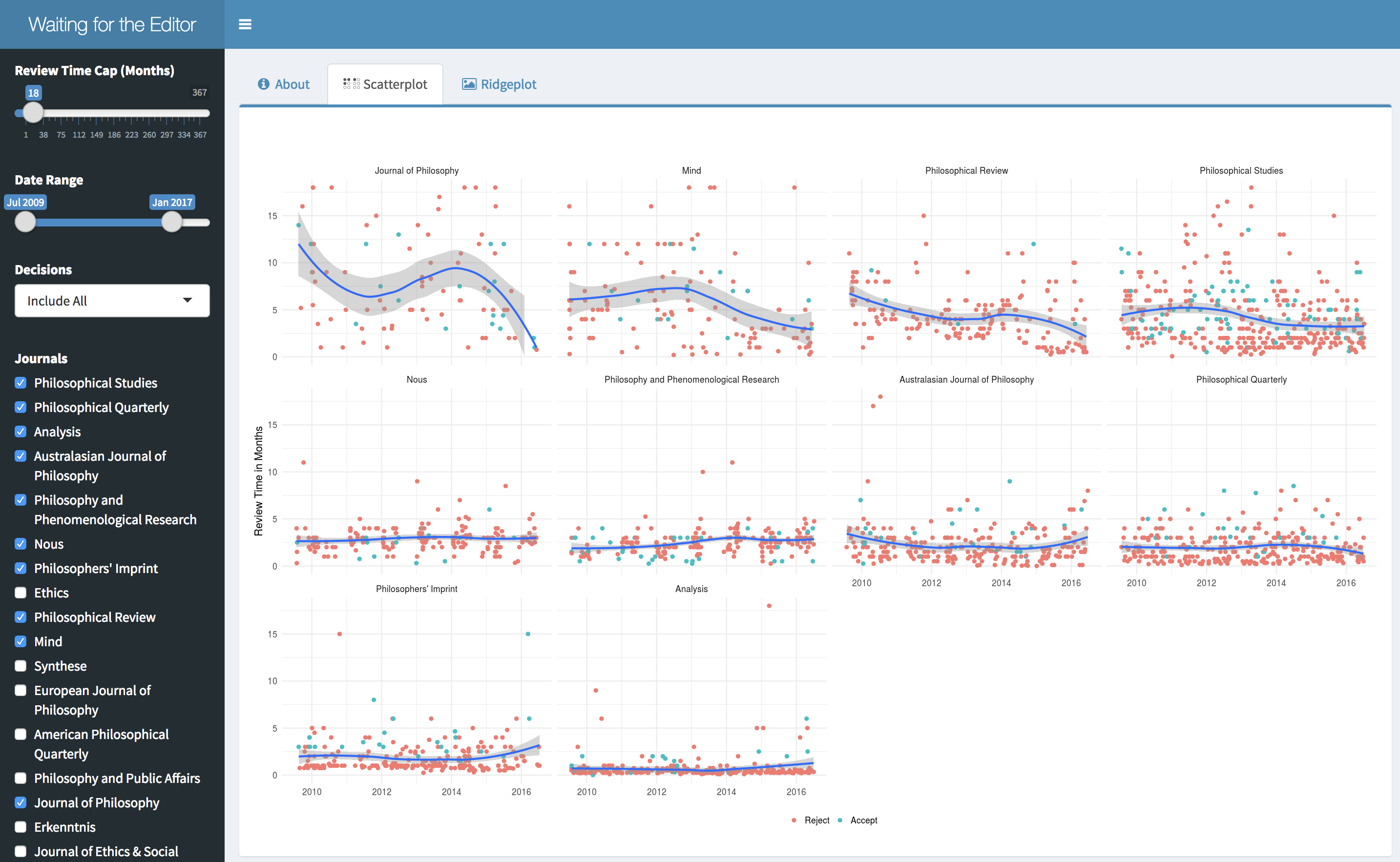
If waiting to hear back from journals makes you as twitchy as it makes me, you might appreciate Waiting for the Editor. It’s a little app that displays wait time forecasts and data from the APA Journal Survey.
It has two kinds of display, based on my earlier post about the APA survey. You can view scatterplots:
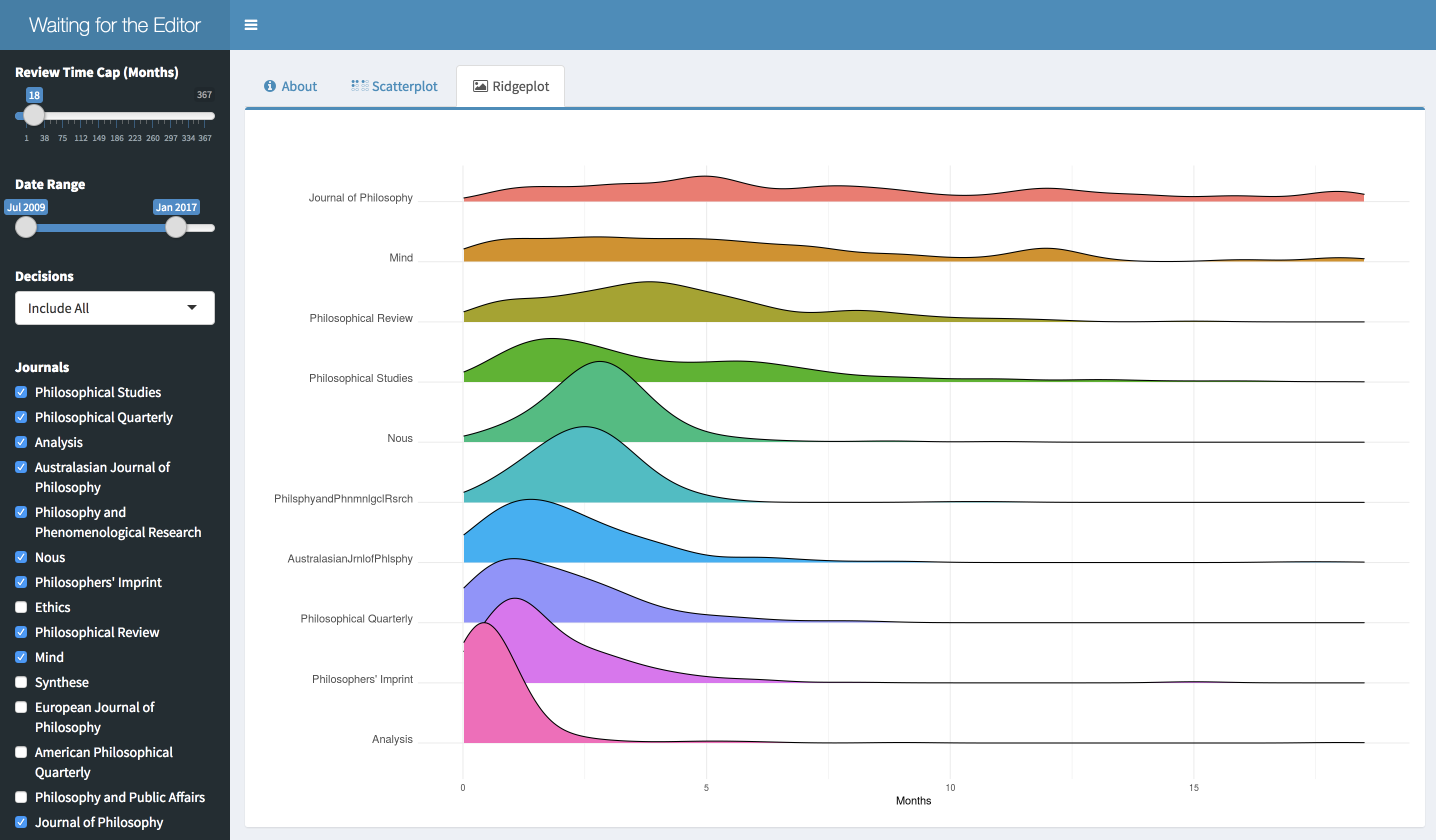
Or ridgeplots:
Note that the ridgeplots can be misleading. They treat old data and new the same. So if a journal’s wait times have improved/worsened since the survey started in 2009, this won’t be reflected in the ridgeplot.
You can customize these displays by…
- selecting which journals to show.
- including all submissions or just e.g. rejected ones (since accepted submissions are overrepresented).
- choosing what dates you want to draw the data from, since some journals have gotten better/worse since 2009.
- choosing your own cap for the maximum review time.

